

Have you ever wondered why you feel so relaxed in a room painted in soft blue or so energized in a space bathed in bright yellow? The answer lies in the psychology of paint colors. The hues we choose to adorn our walls can significantly impact our mood, emotions, and even our productivity.
Color psychology is a field of study that explores the psychological effects of different colors. It delves into how colors can influence our perceptions, emotions, and behaviors. While individual experiences and cultural factors can play a role, there are some general trends that have been observed.
Warm colors, such as red, orange, and yellow, are often associated with energy, excitement, and passion. These hues can stimulate the nervous system, increasing heart rate and blood pressure. Here’s how these colors might affect you:
Cool colors, such as blue, green, and purple, are often associated with calmness, relaxation, and tranquility. These hues can have a soothing effect on the nervous system, reducing stress and anxiety. Here’s how these colors might affect you:
Neutral colors, such as white, black, gray, and beige, are versatile and can be used to create a variety of moods. They are often used as a base color in interior design and can be paired with more vibrant hues to add interest.
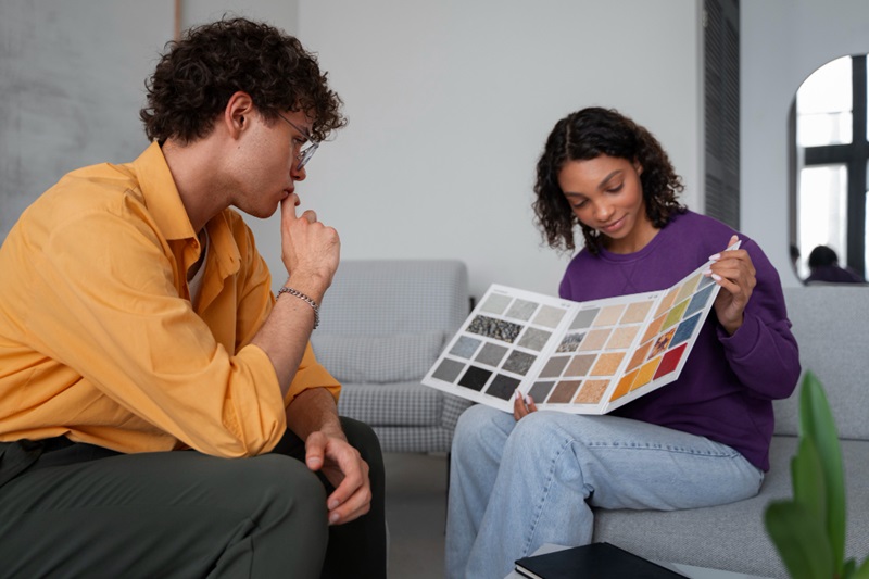
When selecting paint colors for your home or office, consider the purpose of the space and the mood you want to create. For example, if you’re looking to stimulate creativity and productivity, you might choose a warm color like orange or yellow. If you’re seeking relaxation and tranquility, a cool color like blue or green might be a better option.
By understanding the psychology of paint colors, you can create spaces that not only look beautiful but also promote your well-being and productivity.
At Paint On Walls, we’re more than just painters; we’re visionaries. We believe that your home or business should be a reflection of your unique style and personality.
Copyright © 2024 Paint On Walls Pvt Ltd.